It claims the brand will boost inclusivity and engage homebuyers
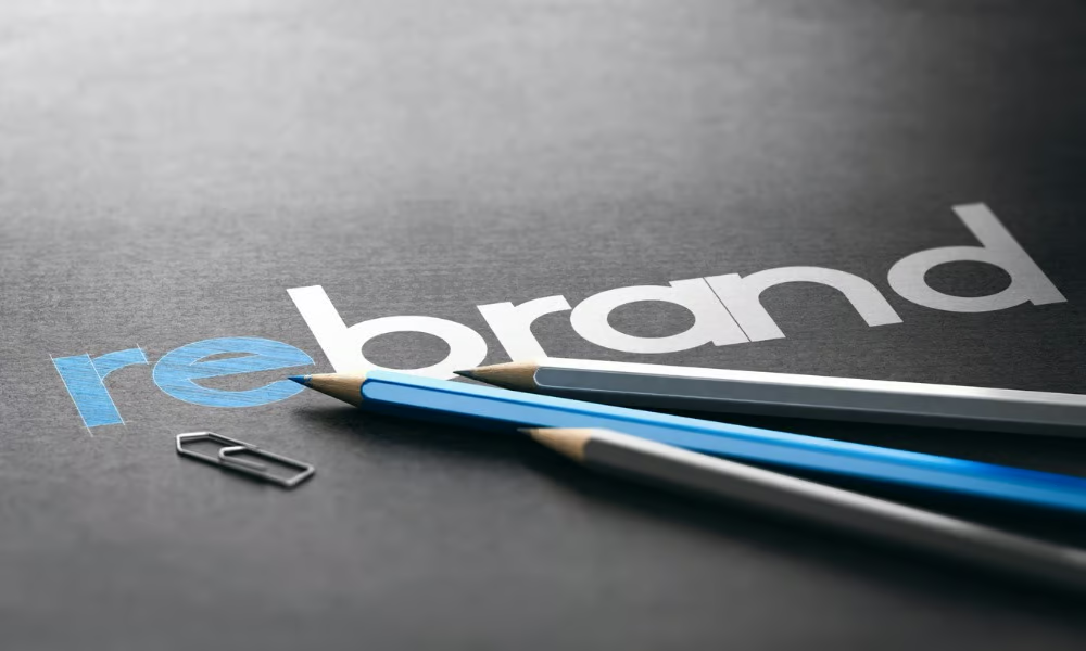
Rocket Companies will now be known simply as "Rocket" as part of a major overhaul of its brand identity, which also sees the Amrock name scrapped.
The Detroit-based fintech platform has consolidated its services under this unified brand, aiming to create a more cohesive experience for homebuyers.
The rebranding effort includes the acquisition of Rocket.com, a redesigned logo, updated wordmark, new typefaces, and an adjusted color palette.
As part of the rebranding, several key businesses have been renamed. Amrock, the national title producer and settlement provider, is now "Rocket Close”, and Amrock Title Insurance Company has been rebranded as "Rocket Title Insurance Company”. Additionally, Rocket Pro TPO has been shortened to "Rocket Pro". These changes are meant to simplify Rocket’s services.
The brand transformation will also be highlighted by a Super Bowl campaign that underscores the role of homeownership in uniting the nation.
The company intends to emphasize the pride and belonging that comes with owning a home. It aims to appeal to various key demographics, including Hispanic, female, Veteran, and first-time homebuyers, while maintaining its connection with existing customers.
"Homeownership is a fundamental building block of the American Dream. As the category leader, it is important that every aspect of the Rocket brand lives up to this iconic ideology," said Jonathan Mildenhall, chief marketing officer of Rocket Companies.
Mildenhall explained that the design evolution reflects Rocket's belief in the transformative power of homeownership and positions the brand as "timeless and empowering for those striving to achieve their dreams."
The updated brand features several elements, including the new 'Halo' logo, which symbolizes trust and the journey toward homeownership. The logo’s circular shape represents protection and prosperity. The refined wordmark has transitioned from block capitals to title case for a more approachable tone. Additionally, two custom typefaces have been introduced, which reflect the company's commitment to consistency across various platforms. The iconic Rocket Red has been softened to reflect inclusivity and compassion, while the company's visual storytelling now features real clients to highlight the diversity of America.
The rebranding was developed through a collaboration between Rocket’s internal teams and the design agency Otherway, taking six months to refine.
Do you think this new brand direction will resonate with Rocket's target audience? Share your thoughts in the comments.


