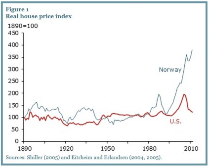
 (aei-ideas by James Pethokoukis) -- Some stunning housing charts, via a new economic letter from the San Francisco Fed. The one at the top of this blog post plots real housing prices in the U.S. and Norway from 1890 to 2011. After peaking in 2006, U.S. real house prices fell by around 40%, but Norway just keeps going up and up and up, including a 30% rise since 2006.
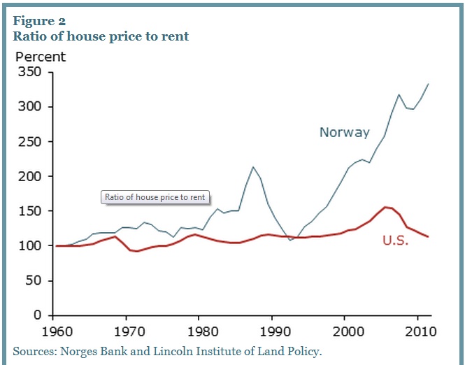
The next chart “plots price-rent ratios in the United States and Norway since 1960. The U.S. ratio peaked in early 2006, but has since fallen to its preboom level. The price-rent ratio for Norway has continued to trend upwards and currently stands about 50% above its last major peak achieved two decades ago.”


